This documentation will explain the various possibilities for manipulating the Table view. We will be using the previously generated iris Table from the How to import data Table guide.
Here is how our Table looks:
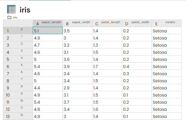
When you hover a cell, a row or a column you have information about it (name, value, tags, type...).
Right panel
The right panel provides information about the Table. To open it, simply hover your mouse over the grey border on the right side of the Table. The panel displays the number of loaded rows and columns (as only a portion is loaded in the browser), as well as the total number of rows and columns in the Table.
In the right panel, there is also a section for Columns and Rows tags. Here, you can view all the available tags. By clicking on the pen icon next to the tag key, colored circles will be added to all the columns or rows based on their tag values. This feature allows you to easily identify the tags associated with the columns or rows. For example, here first rows are tagged with variety:Setosa.
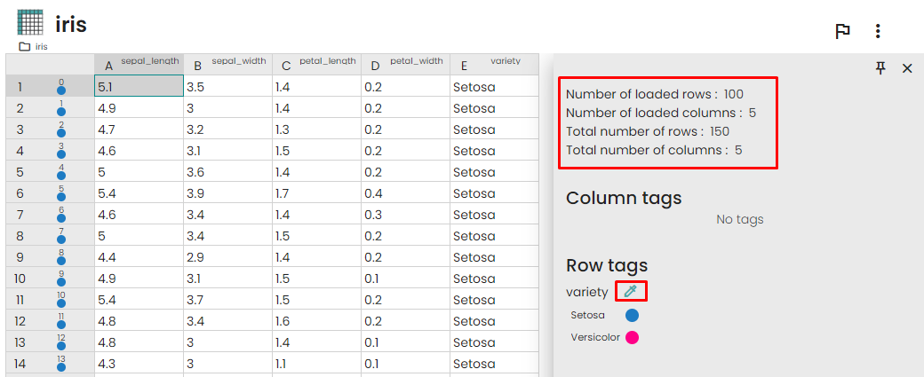
You can hide or show the circles for a specific tag value by clicking on the tag value itself. Additionally, you can change the color of the circle by clicking on the color icon next to the tag value.
Generate plot from table
Simple scatter plot
To generate a scatter plot in the Table view, follow these steps:
- Select the sepal_length column.
- Right-click on the selected column and choose
Create Chart.
- A configuration popup will open.
- In the configuration popup, select the chart type as
Scatter plot.
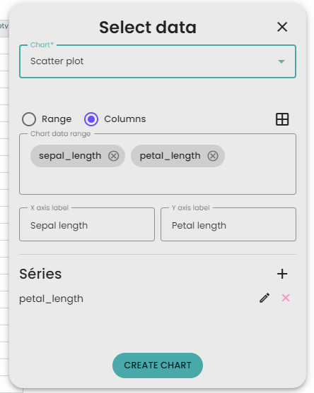
- In the column selection, choose sepal_length and petal_length. By default, for a scatter plot, the first selection (here sepal_length) is used as the X-axis, and the second selection (here petal_length) is used as the Y-axis. This section allows you to quickly create series.
- Name the X-axis as "Sepal length" and the Y-axis as "Petal length."
- Click on
Create Chart to generate the scatter plot.
Here is the result :
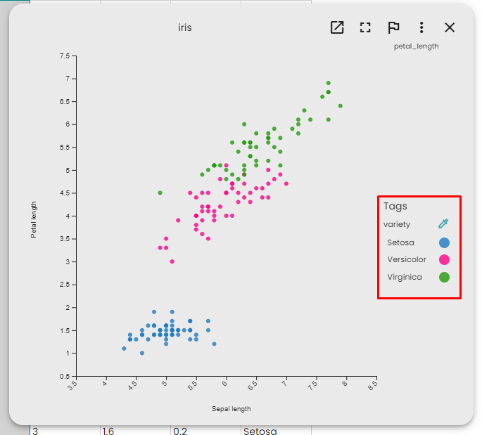
You can check each dot value with you mouse.
You can click on the tags on the right to color the dots based on table row tag. This is one of the special power of table tags.
Advanced scatter plot
To create a scatter plot with Sepal length as the Y-axis and Petal length as the X-axis, specifically selecting rows 40 to 60, follow these steps:
- Right-click anywhere on the table.
- Click on
Create chart. - Select
Scatter plot as the chart type. - Leave the upper section as it is, as we will create our series manually.
- In the series section, delete the existing series and click on the "+" button to create your own series.
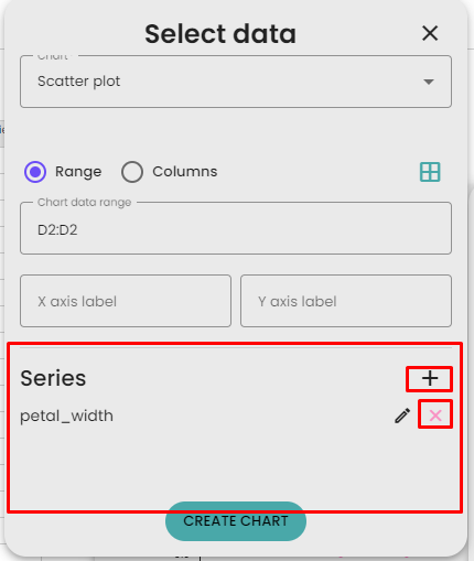
- A new popup, the advanced series configuration, will appear.
- Set the series name as "Sepal."
- For the X-axis, you want to select only rows 40 to 60 of the Petal column. To do this, click on the
Select cell button and use your mouse to select rows 40 to 60 of the petal_length column. The input should be filled with the value: C40:C60. - Do the same for the Y-axis, using the
sepal_length column. Your form should look like this:
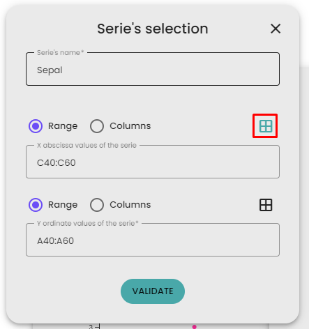
Click on "Validate" to confirm your series and then click on "Create chart" to generate the scatter plot.
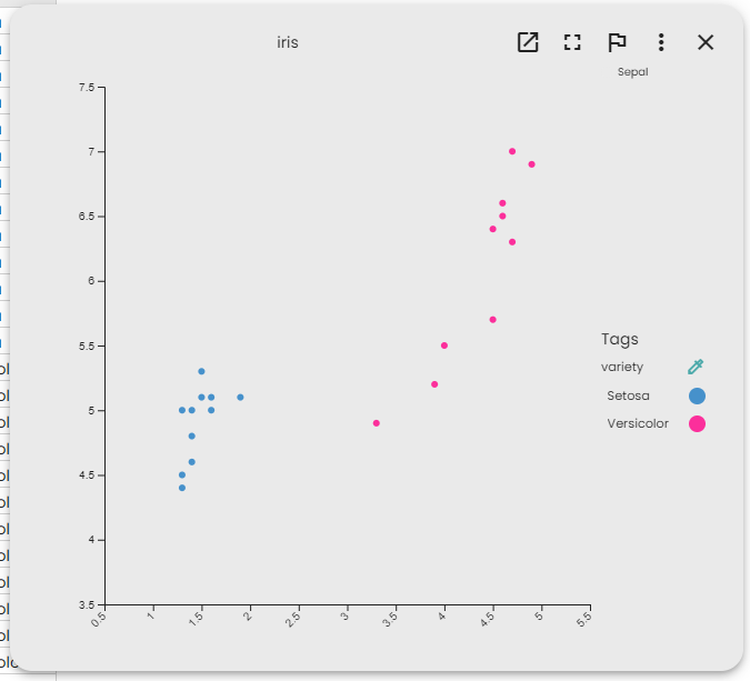
Here is how the chart should look lie. There are only 20 dots are we manually reduces the selection. You can verify that the X value are the petal length by selecting a dot with your mouse.
View parameters
Load a specific section of the table
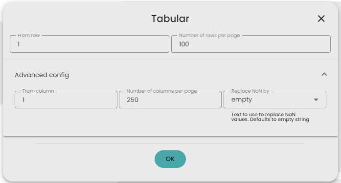
When you generate the Table view, it will open the view configuration form. From here, you have the option to display only a specific portion of the Table. This can be helpful if your Table is large and you want to focus on a particular range of rows.
Manage NaN values
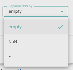
When you generate the Table view, it will open the view configuration form. From here, you have the option to choose how to handle NaN (Not a Number) values. By default, it displays an empty box for NaN values. However, you can choose to display the NaN or "-" strings instead.
