Introduction
Here we briefly show how to use data charts to visualize data with Constellab.
Generalities on Plotly within Constellab
On Constellab, 2D line plot, scatter plot, violin plot, box plot, bar plot and histogram from plotly share common features.
They have the same input and output. It takes as an input a Table and it produces a PlotlyResource as an output.
And they also have parameters in common, here are the most used ones :
- The
x-axisandy-axisare the names of a columns to use in the input data -
title: Title of the plot. -
x_axis_name: Title for the x-axis. -
y_axis_name: Title for the y-axis. -
color: Column name or variable used to color the lines or markers on the plot. -
hover_data: List of columns to display as hover text when hovering over data points on the plot. -
facet_col: Column name or variable used for creating column facets (subplots). -
facet_row: Column name or variable used for creating row facets (subplots). -
log_x: Specifies whether the x-axis should be displayed on a logarithmic scale (True/False). -
log_y: Specifies whether the y-axis should be displayed on a logarithmic scale (True/False).
Prerequisites
To plot your data, you need to put it into a Table.
Several datasets will be used in this story:
- The IRIS dataset: The Iris dataset consists of 50 samples from each of three species of Iris flower (Iris setosa, Iris virginica and Iris versicolor), in which four features are measured from each sample: the length and the width of the sepals and petals, in centimeters.
- The titanic dataset : The titanic dataset consists of the passengers of the titanic with various information such as their age, sex, embark town, fare, passenger class, whether they were travelling alone or not, and their deck.
- The Gapminder dataset : The gapminder dataset collects data from a handful of sources, it has a unique identifier : the country, and mutliple variables such as the life expectancy, tje employ rate, the urban rate... for more information : https://www.kaggle.com/datasets/sansuthi/gapminder-dataset
- The penguins dataset : the penguins archipelago dataset consists of 344 samples of three species of penguins from three islands. it present the island, the species, the sex, the mass, the bill length and depth and the flipper length of each being
2D line plots
To learn more about
the parameters, please refer to our technical documentation
Plotly documentation.
It has some specific parameters, the useful ones are :
-
line_shape: you can have a smooth curve or a straight line between each points -
markers: to show or not the marker for each point
Live code
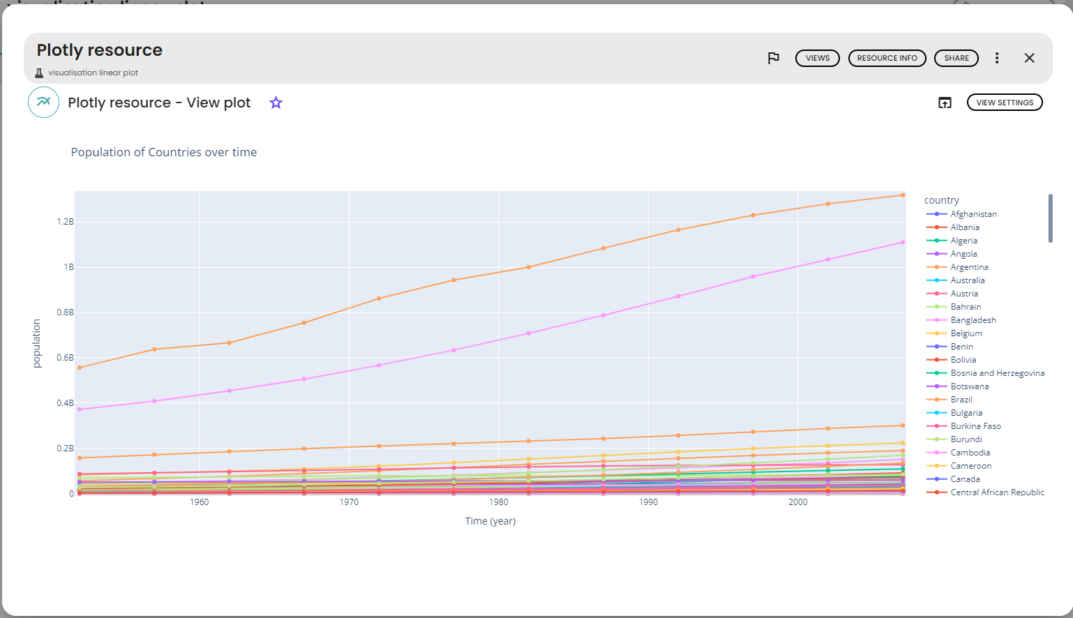
The code used to render the plot is given as follows
# parameters
x='year'
y='population'
title='Population of Country per year'
y_axis_name = "population"
x_axis_name = "Time (year)"
line_group='continent'
color='country'
#live code
from gws_core import Table, PlotlyResource
import plotly.express as px
fig = plotly.express.line(data_frame=sources[0],
 x=x, y=y, color=color, title=title, line_group=line_group
)
# Update axis titles
fig.update_xaxes(title='x_axis_name')
fig.update_yaxes(title='y_axis_name')
outputs = [PlotlyResource(fig)]
Rendering
The rendering of the plot is as follows :
2D scatter plots
It has some specific parameters, the useful ones are :
-
size: for the size of the markers -
opacity: for the opacity of the markers -
symbol: to choose a symbol per value
For this example, we will use the penguins dataset and the following parameters:
-
x-axis: bill_length_mm -
y-axis: bill_depth_mm -
Color: island -
Title: Bill length depending of the depth -
y axis name: bill depth -
x axis name: bill length -
symbol: species
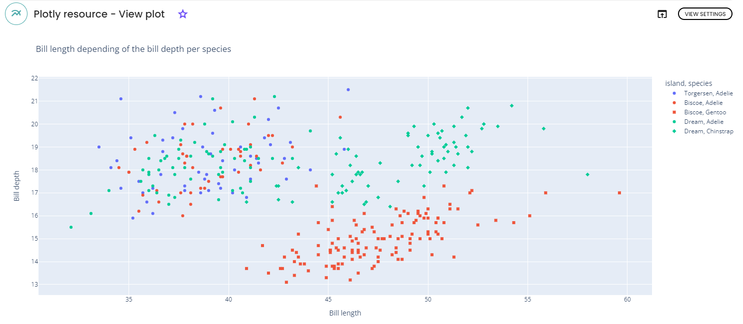
For more informations about each parameter , please click here.
Bar plots
It has some specific parameters, the useful one is :
-
bar_mode: to chose how to show your bars, stacks, side by side...
For this example, we used the penguins dataset and the following parameters:
-
x-axis: species -
color: sex; -
Title: gender of penguins per species; -
y -axis name: count -
x-axis name: species, bar_mode: stack.
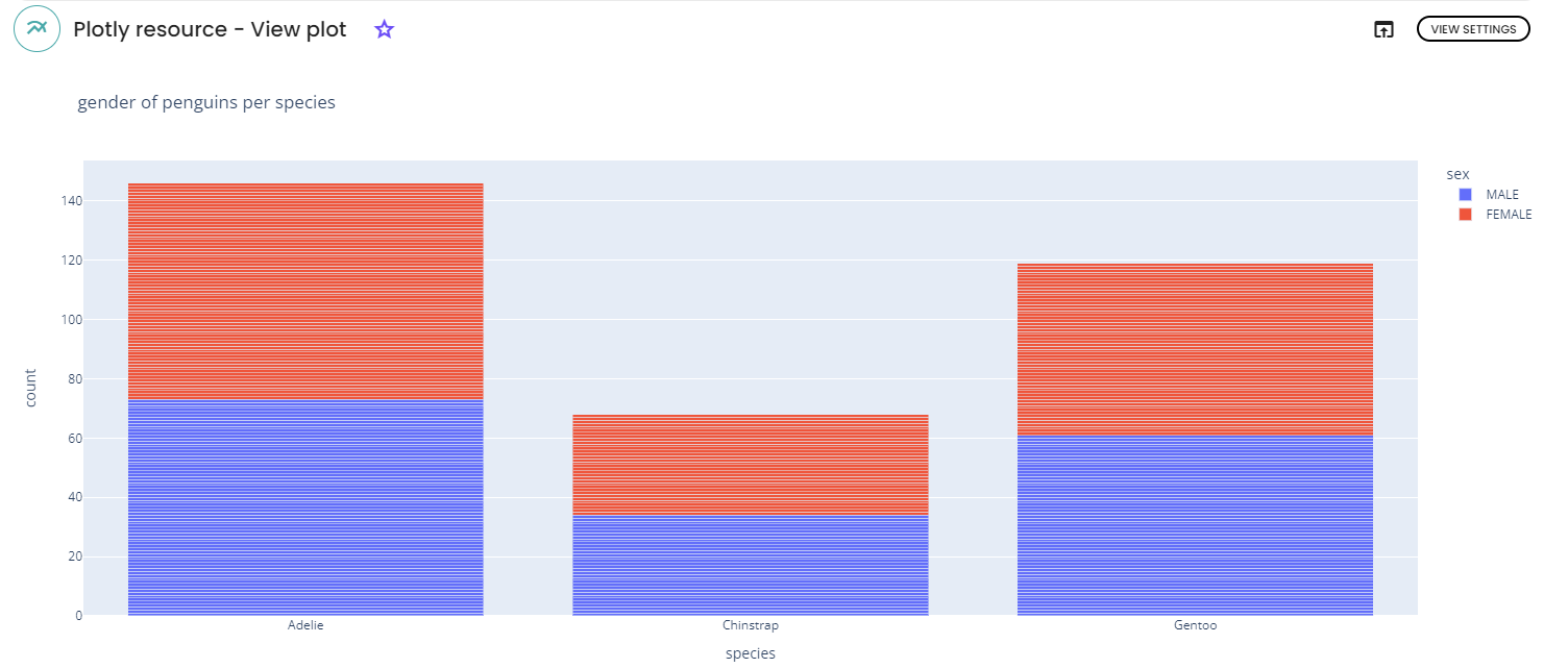
For more informations about each parameter , please click here.
Box plots
It has some specific parameters, the useful ones are :
-
boxmode: places the boxes beside or on the top of each other -
points: shows outliers, suspect outliers or all points -
notched: draw boxes with (or without) notches
For this example, the penguins data set and the following parameters were used:
-
x-axis: island -
y-axis: bill_length_mm -
color: species -
Title: Penguins bill length per species and island -
y-axis name: Bill Length -
x-axis name: Island
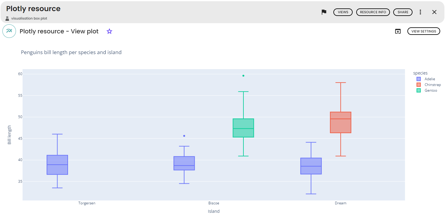
For more informations about each parameter , please click here.
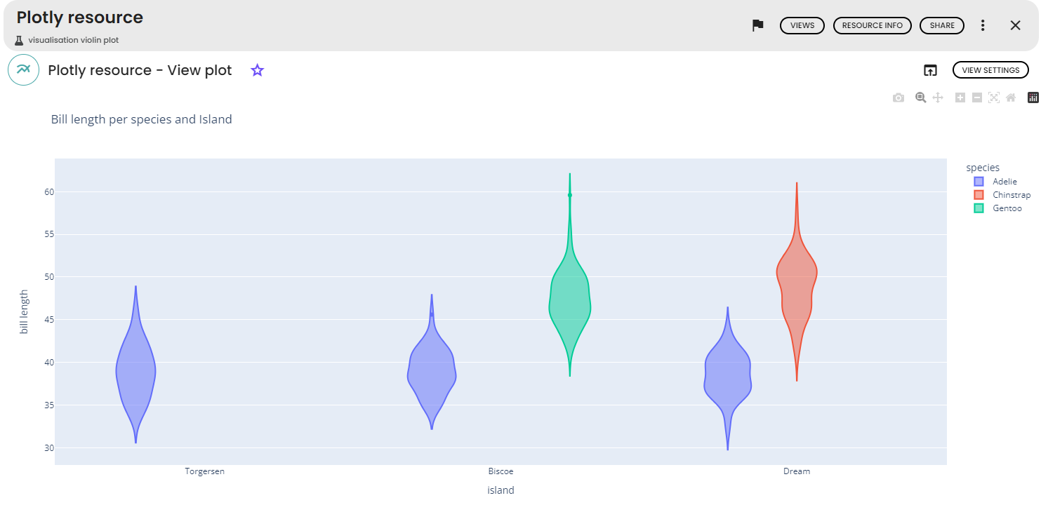
Violin plots
It has some specific parameters, the useful ones are :
-
violinmode: places the violins beside or on the top of each other -
points: shows outliers, suspect outliers or all points -
box: draw boxes with (or without) notches - For this example, we will use the
penguinsdataset and the following parameters :x-axis: island -
y-axis: bill_length_mm -
Color: species -
Title: Bill length per species and island -
X-axis Name: island -
Y-axis Name: bill length
For more informations about each parameter , please click here.
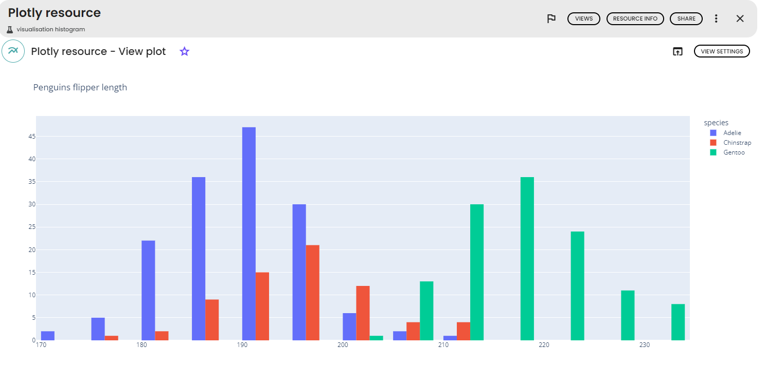
Histograms
It has some specific parameters, the useful ones are :
-
bar_norm: to show the relative values -
histnorm: for the histogram normalisation -
histfunc: to chose the function to use among count, sum, avg, min, max -
cumulative: for a cumulative histogram -
nbins: to set the number of bins. -
opacity: for the opacity of the bins -
barmode: For stacked of grouped histograms
For this exemple, the Penguins dataset and the following parameters were used :
-
x-axis: flipper_length_mm -
Color: species -
Title: Penguins flipper length per species -
Y-axis name: count -
X-axis name: Flipper length (in mm) -
histogram function: count
For more informations about each parameter , please click here.
If you need a particular plot that is not presented above, you should try the smart plot task.
For example, line charts are well suited for showing change over time whereas box plots can be used to look at how data is distributed. Scatter plot is a standard way of
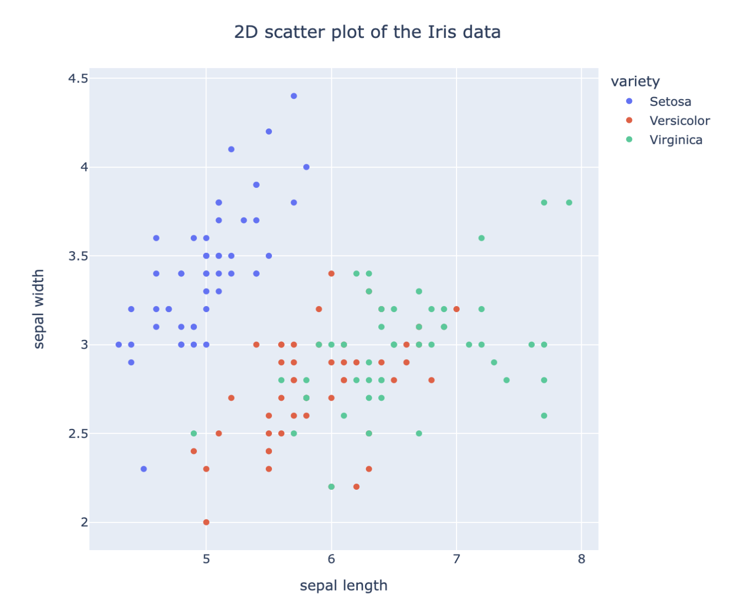
Smart Plot
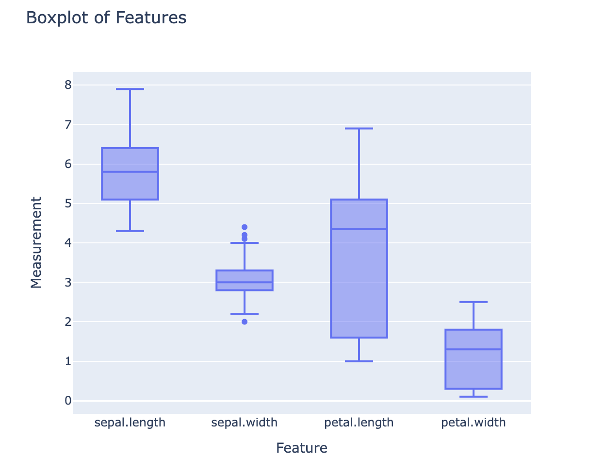
After having imported the iris dataset in the Databox of the lab, click on 'views' and select 'Smart interactive plot'. You can now write your request for the figure you want to plot from the data. For example, one can ask for a 2D scatter plot of the data with different colors according the species of the sample and specify the axis labels and figure title.
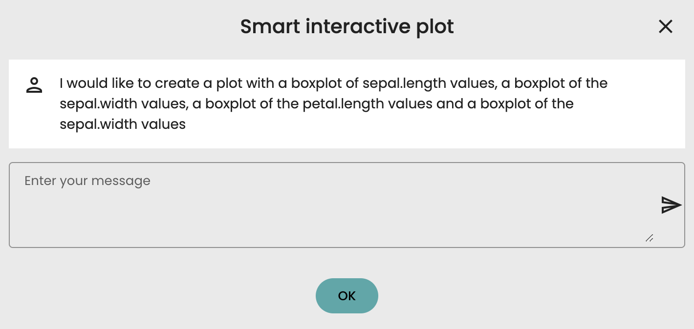
Other chart types can be used to extract other kinds of interesting information. For example, boxplot chart as shown below. Here we write a request for a boxplot of the values of each features of the Iris dataset. With this type of chart, we get a synthetic overview of the distribution of the samples (median, 1st and 3rd quartile,...) for each feature.

Comments (0)
Write a comment