Principal Component Analysis (PCA) is a widely used tool to help scientists to discover important relationships in datasets. More theoretically speaking, PCA aims at identifying the combination of features (a.k.a principal components) that explain the main trends in your data.
We show here how to use Constellab to apply PCA method for data analysis, using the well-known IRIS dataset. The IRIS dataset consists of 50 samples from each of three species of Iris flower (Iris setosa, Iris virginica and Iris versicolor), in which four features are measured from each sample: the length and the width of the sepals and petals, in centimeters.
Let's go!
Data preparation and preview
We start by loading the iris dataset in the Databox of the digital lab. One can have a preview of the raw dataset by selecting the imported file.
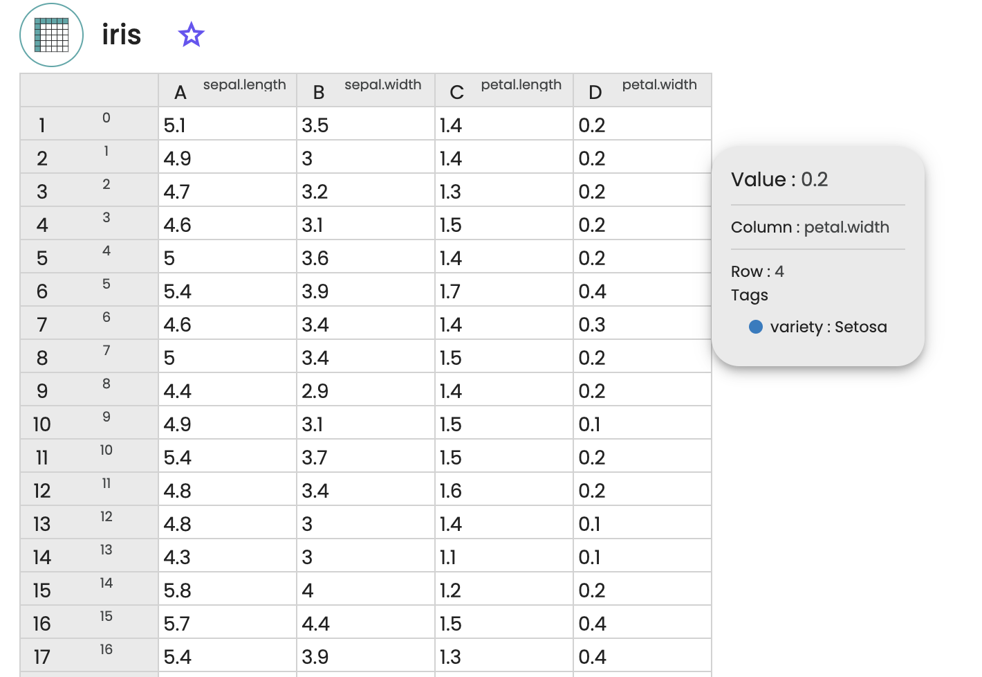
Here the first 4 columns correspond to each of the 4 features of the dataset (the sepal length, the sepal width, the petal length, the petal width, in centimeters), while each line corresponds to a sample of the dataset. Each sample is tagged with the corresponding species (setosa, virginica or versicolor).
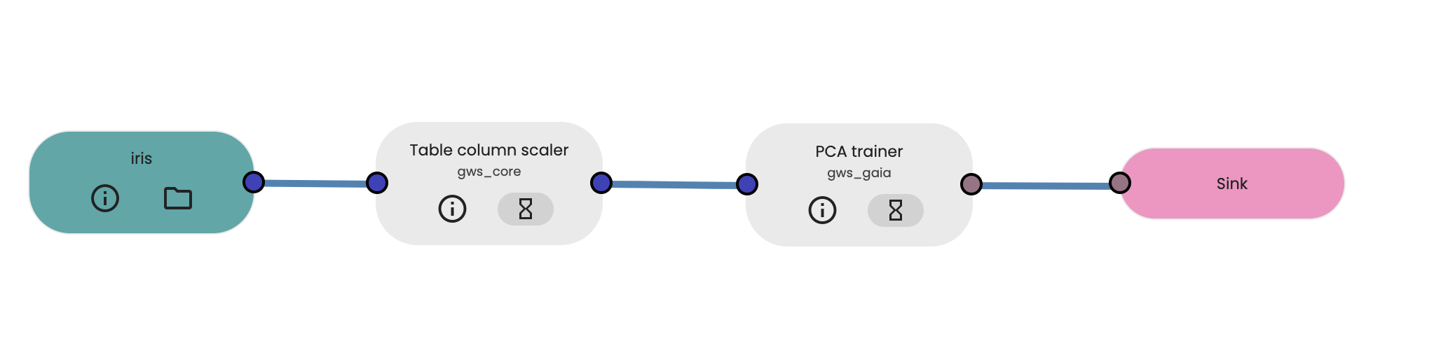
Building of the workflow for the PCA analysis
We then build the workflow that will be used for our analysis, by selecting and connecting together:
- the resource containing our processed Iris data as input data,
- the Table column scaler task to standardise the dataset (means=0, standard deviation=1)
- the PCA task, with a number of principal components computed set to 2 (meaning that we keep the two main components of the PCA analysis), and
- the output process which will collect the result of our analysis.
Running the PCA workflow analysis and viewing the results
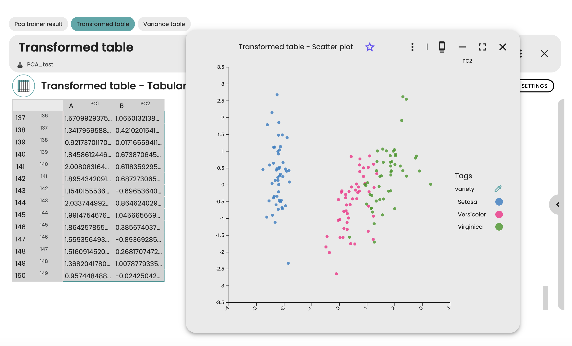
After running the experiment, we can access the results in a table, as well as in a 2D scatter plot to see the first 2 principal components of the Iris dataset. Each dot of the scatter plot corresponds to a sample of the Iris dataset, while each color denotes the species of the sample. Here, we see a clear separation between setosa species and the other species, whereas versicor et virginica species are less well separated.
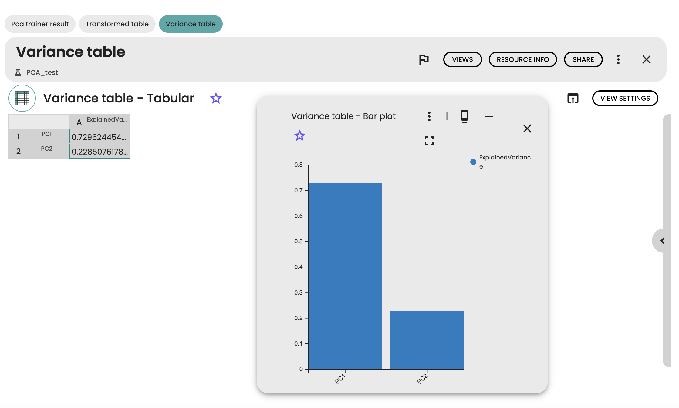
We can further get the variances explained by each component in a bar plot view. Here, we see that a large part of the variance of the Iris dataset is explained by the first principal component (more than 70%).
Your experiment and your report can now be shared among your nice collaborators 😀.

Comments (0)
Write a comment